Italians always had an out of the ordinary taste in home design, and their kitchen design ideas outdone any other designer. SCIC is responsible for the kitchens you will see in this post. SCIC is an Italian interior design company, specialized in kitchen designs. They keep the architecture as simple as possible and in just 3-4 colors, but the kitchens are fully functional, and your cooking will be enjoyable and relaxing in such kitchen.
A blend of white and yellow makes this first kitchen pleasant to the eyes. It is well illuminated all the shelf and drawers are well organized. A simple table is on the left side, and a white pear shaped lamp is above it.
A darker colored kitchen with black furniture. The large windows compensate and makes the space well illuminated and blending perfectly with the environment.
Another kitchen design with many large windows, that lets the natural light inside. The floor an furniture is mane of wood, which looks outstanding in a kitchen.
A blend of white furniture and grey painted walls gives a neat design to this kitchen. In front there is a white dinning table with white simple chairs, and the bar has two futuristic chairs to enjoy your drinks as you do at a pub.
This wood textured kitchen is one of a kid. The serving place is made of a single massive wood board with two chromed chairs. The glass wall makes the kitchen look bigger than it is, and the spiral stair is a nice touch.
This light wood textured kitchen has an interesting design. The way it is assembled makes it look like it floats above the floor. The big window fills the kitchen with worm natural light.
Another dark kitchen, with big widows, a black dinning table with transparent chairs. The floral wall is not in the same color tone, but it blends perfectly to the whole atmosphere.
A shinny brown kitchen, is not so usual, but this design is perfectly done. The serving place is made from one massive wood board that gives the optical illusion that it floats in mid air. Everything is simple, besides the two curved chairs.
Another large kitchen, with large windows and simple furniture textured in a blend o shiny white and dark wood. The serving table is again one of those that looks like it float, and the two minimalist square chairs blends with the whole straight lines design.
This is a really minimalist kitchen design, made just from a cooking place and a large storage place with 4 simple large doors. Thee room is placed in is made with glass walls an a curved stair case takes you up to the dinning place, to enjoy the view as you serve your food.
A demonstration of intelligent use of a small space to fit a kitchen in. This one is textured in white and dark wood. Everything is simple, with straight lines design, an the cylinder lights on the ceiling gives it a fine touch.
Another successful blend of shiny furniture with dark wood.
This kitchen has an more crowded design, yet it looks like a minimalist kitchen. In the middle there is a large shelf, where you can store your cooking books, the rest of the kitchen is textured in shiny white wood and dark mate wood. Large windows fills the kitchen with natural light.
Another example of perfectly organized kitchen. Simple cream-colored furniture, with asymmetrical shelves and two simplistic chairs.
This one is by far them most simplistic kitchen here. It is made from white shine wood, having straight lines design all the way, yet it looks phenomenal.
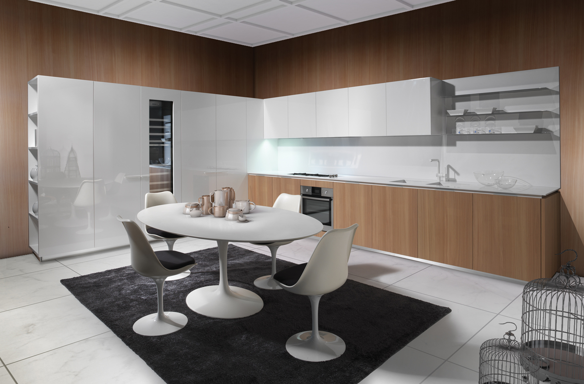
Another minimal kitchen design with wood paved walls and white shining furniture. In the midle there is a round dinning table with 4 rounded white chairs. The floor is made from large white hone tiles.
http://amigosparasiempre4.blogspot.com


0 komentar:
Posting Komentar